Project 1- NERVE Energy Drink
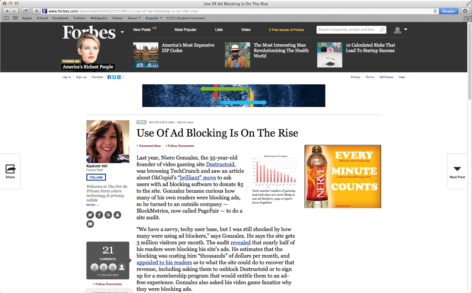
For the first project in my Online Advertising course, we were assigned an energy drink called NERVE. We were meant to design the whole online ad campaign, and overall brand personality, of this fictitious product.
Concept
To start with, we had to decide on what demographic we would be selling to, and then come up with a fitting brand personality. I decided that I wanted to make a pure energy drink, marketed towards college students and working professionals alike. The overall concept was the sands of time, and making the drink something to maximize efficiency.
Process- Logo
 |
| Initial Logo |
Once we had our overall concept, we got to work, coming up with a logo first. I knew going in that I wanted to create a logo that incorporated an hourglass and/or a clock. I, at first, created a clock that incorporated lightning, to go for the energy angle of the product. It was pointed out to me that, while not terrible, it resembled several existing brands already, and didn't really have that unique a look to it. I decided to keep the general idea, then, and change it around a bit.
 |
| Final Logo |
While keeping the lightning aspect in the logo, I changed how it was incorporated, changing it instead to the "V" in NERVE. I also decided on my colour scheme at this time, and so I incorporated the golden colour into the colour of my clock. When I had it shaped the way I wanted, I proceeded on to the text.
After several sessions of trial and error, I decided a blocky sans serif would work best. A bit more trial and error later, and I had the font face I would go with. After that, it was a matter of customizing the font to make it a bit more unique and difficult to replicate. Once I had approval of the logo, I moved on to creating a comp of the product's bottle itself.
Process- Bottle
 |
| Bottle |
When the label was done, I proceeded to shade it to make it appear more realistic on the bottle. Once I had it as realistic as a simple comp would lend itself to, I worked on the rest of the bottle itself. I applied a colour filter to the water within the bottle to make it match what I was going for, as well as changing the bottle cap.
At the last pass-through before presentation, it was pointed out that, as it was a new product and didn't scream its purpose with the bottle design, a descriptor line would probably work well in favor of the product, so I added one aligned with the N of NERVE, setting it horizontal to make it clear that it's a separate element.
Process- Theme
 |
| Initial Theme |
 |
| Final Theme |
While the theme was better, once matched to the overall design, it was still lacking. With input from my instructor, I finally created contrast, both with the color and with the fonts used. The idea to use the logo was there in the initial theme, as well, but for the new layout, it worked better as an accent point at the end of the theme's look.
Process- Online Ad Campaign
Once we had our theme set, we got to work on building our online ad campaign. We were to create 3 ads in one of 4 sizes. When we had these 3 completed, we then applied the campaign to the other three formats. My process was a lot of trial and error. Initially, I was stuck in my "Sands of Time" concept, and was using a sandy background for my ads. This not only made the ad's readability much lower, but also muddied the overall result. When I removed the sand, I was left with a clean design, but a very boring design where the text was fairly bland, with just my bottle, some stock text, and a lot of bad white space.
With a very helpful demonstration from my instructor, I got into the right mindset for fixing my campaign. The new design better used my colour scheme and the overall space for the ad sizes, and had a great deal more personality to it. Once I had this set up, and changed my theme to match the font I went with, the next step was practical application. We screen-capped websites with ads on them, and plugged our ads into the adspace. I decided to add in a mobile screencap, as well.
Process- Landing Site
 |
| Landing Page Design |
The final step in our process was comping a landing page. Due to time constraints on the project, I left it as a comp, for now, but I plan on coding the site to be functional for portfolio purposes later on, since web design is one of the services I offer.
I decided to make the layout follow the ads' layouts, with added elements to collect data and add more information for the brand.
Result
Considering this is the first ad campaign I've done in my education, I think it came out quite well. The logo and landing site design were, expectedly, the parts the came easiest to me, since those kinds of things have been most of the focus for both class and personal projects for the past 3 years for me. The test of how well I retain the idea of carrying a brand personality through an ad campaign will come with our next project, where this whole process, which began in the first week of September and ended during the first week of November, will be condensed to a real-world schedule of a two-week deadline. Here's hoping I've caught the info as well as I thought.


No comments:
Post a Comment