Project 3- Typographic CD
Our 3rd Creative Art Direction project was creating a purely typographical interpretation of a song of our choice, and designing that interpretation into a CD cover, 4-page folding booklet, and folder for the CD. No photography or illustration were allowed, making it a much more difficult thing to concept for, but also a pure-profit project.
Concept
After a few hours of going through every song on my computer, I narrowed my choices of songs down to four. Of them, they were Spiral Circle's "Goddess and the Weaver," Otep's "Perfectly Flawed," Tom Waits's "Satisfied," and Gaelic Storm's "Devil Down Below." Goddess and the Weaver and Perfectly Flawed were both very same-y songs, that maintained their tempo throughout, making them have no highs or lows. While both have interesting concepts, they were given the axe.
The choice was then between Satisfied and Devil Down Below. Both have a variety within the song, and have character to them. In the end, I decided that, while Tom Waits's voice and music has a ton of character to them, the actual lyrics of Satisfied made for a pretty lacking concept. On the other hand, Devil Down Below has a solid concept, and because of how jarringly different the concept and the actual sound of the song are, it would give me a lot to work with. In the end, I went with Gaelic Storm. Going further, you can give a listen to a sample of the song, to get an idea of what I was working with, here.
Process- Booklet
The first step in doing the actual project was designing either the band name's or song title's look. I decided to start with the song title's look. I knew going in that I wanted to focus on the overall concept of the song; Irish fishermen are out on the frozen, barren sea, and are determined to not die despite the living Hell they're facing. So a cold, desolate colour scheme was pretty much built in. I decided, to start, to design the booklet's front cover.

Initially, I came up with the idea that I would use texture to get around the restrictions against using illustrations or photos. I used a number of ice and metal photos I'd taken in the past, with a clipping mask in Illustrator. Once I had it masked, I proceeded to alter the mask to form icicles from the text.
Once I had this, I plugged it in and proceeded onto the next step, which was the lyrics. This was where I spent roughly 95% of the remainder of my time during the project. Click on any of the images below to enlarge.
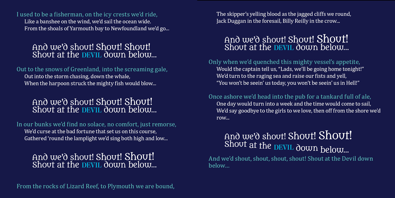

To begin with, I set all of the lyrics as they were, placed right from a text document. I used a typeface named Metamorphous, which has a small trace of Celtic design to it, for the body copy. I also added in some character styles to add a bit of variety, but it was entirely lacking in design. When I realized the issue, I added a bit more concept to the whole thing, and made it so that the text was in waves, simulating the ocean motif of the song. Again, set well, but not exactly designed.

I decided to use the chorus of the song as a large design element, next. It was here that a lot of my frustrations started. I became trapped in the idea of making the text resemble waves, and because of that, even had I designed the chorus well, people wouldn't have had a chance to notice, with how much I was pulling their attention in every direction. The lyrics, at this point, had more design and variety, but it was over-designed, and kind of a mess. However, from this came the chorus's design, which maintained through the rest of the project.

With the next step, I started from the chorus and worked my way from there. I used the same basic design as the previous iteration, but this time, I made it a focal point. The lyrics, at this stage, were incidental, as I wanted to focus on getting the layout and chorus finalized at that juncture.


To finalize this, I did one more attempt at the text. After a demonstration from my instructor, I realized just how over-designed my lyrics really were. With the realization, I first removed all styles from the lyrics, and collected all of them into one text box. Extending that to both sides of the page made it work better as a whole, and once I changed the colors of the different lyrics, I was able to achieve the waves motif I'd originally been going for, but much better. This was made even more effective by doubling the text up and lowering the opacity on the second box, making it simulate submerged text. To finish it up, I added a layer with an inner shadow and blended it to give more depth to the entire booklet.

Process- Folder
 With the booklet down, the next stop was designing something to hold it, and the CD, inside. With everything I'd done for the booklet, this process was thankfully simple. After setting up the di-cut for the glue strips, I set to work writing out the copyright information. Some quick research found Gaelic Storm's album "Bring 'Yer Wellies" to be where the song came from, and I just plugged the information from that CD in. Another thank you note and the band's URL were added to give it a bit more content. I also made up a UPC code in Illustrator, to make it a more realistic product.
That done, I did something similar, but slightly different, for the front of the folder, so as not to just duplicate the design. This time, I cut half of Below off using the pathfinder, and made that segment feathered and lower opacity, to simulate waves.
Process- CD
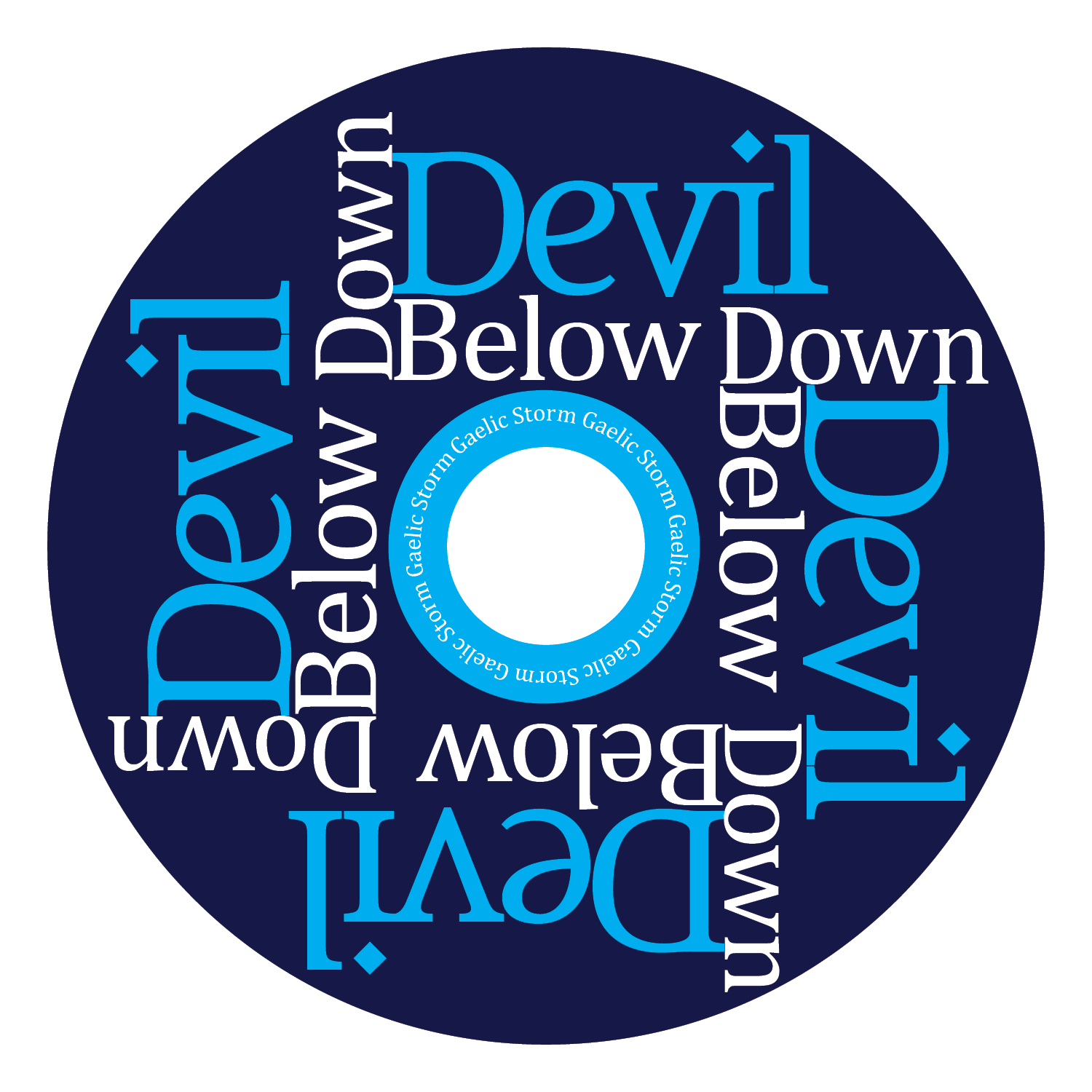
 Once the booklet and folder were done, though, I simply used the original design as a placeholder, and plugged the new elements in. I changed the font for "Devil," updated the color scheme, and worked with "Below" to actually be below the center ring. Last was adding in the shadow and lowering the opacity of the "Below" text, to make it match the overall design.
Result
 The true final step in the process was beyond the design, and went into production. This was, hands down, the hardest project of my whole semester. Taking the actual production step out of it, I had difficulty from start to finish coming up with a solid concept using pure text. Ignoring the CD cutting in its entirety, it was also hands-down my favorite challenge, and the most beneficial for showing me where my design weaknesses lay. Learning the importance of leading the eyes, designing text instead of just setting it, and how effective designs can be when you stick with the KISS principle were all very fantastic bits of knowledge I'll be taking forward.
No comments:
Post a Comment